
Science can be complex, and visual tools can make it easier to understand. This page presents a selection of scientific infographics I created to support research communication and education. Each infographic simplifies data, highlights relationships, and tells a story through visuals. Explore the gallery and see science come alive through design.
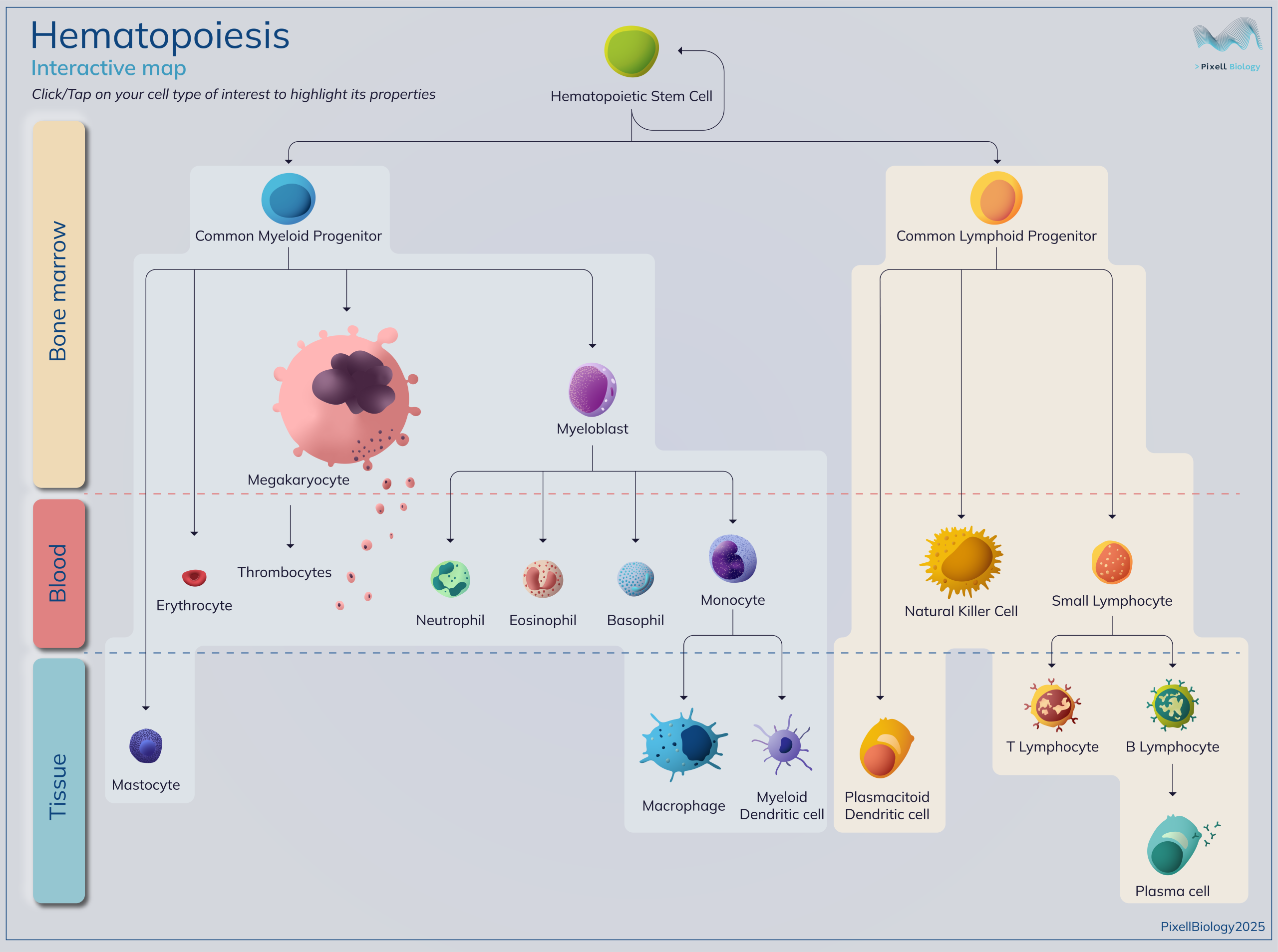
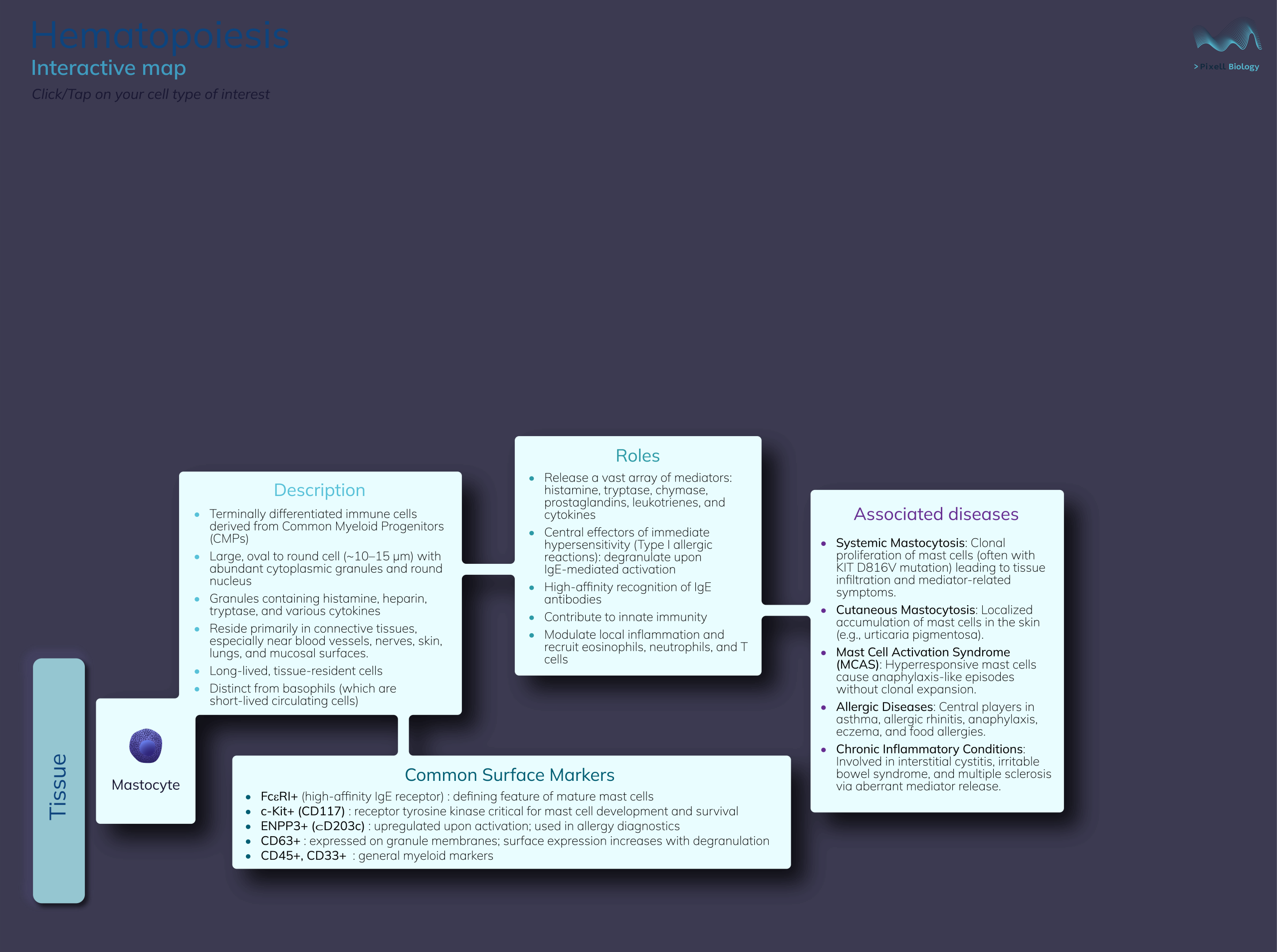
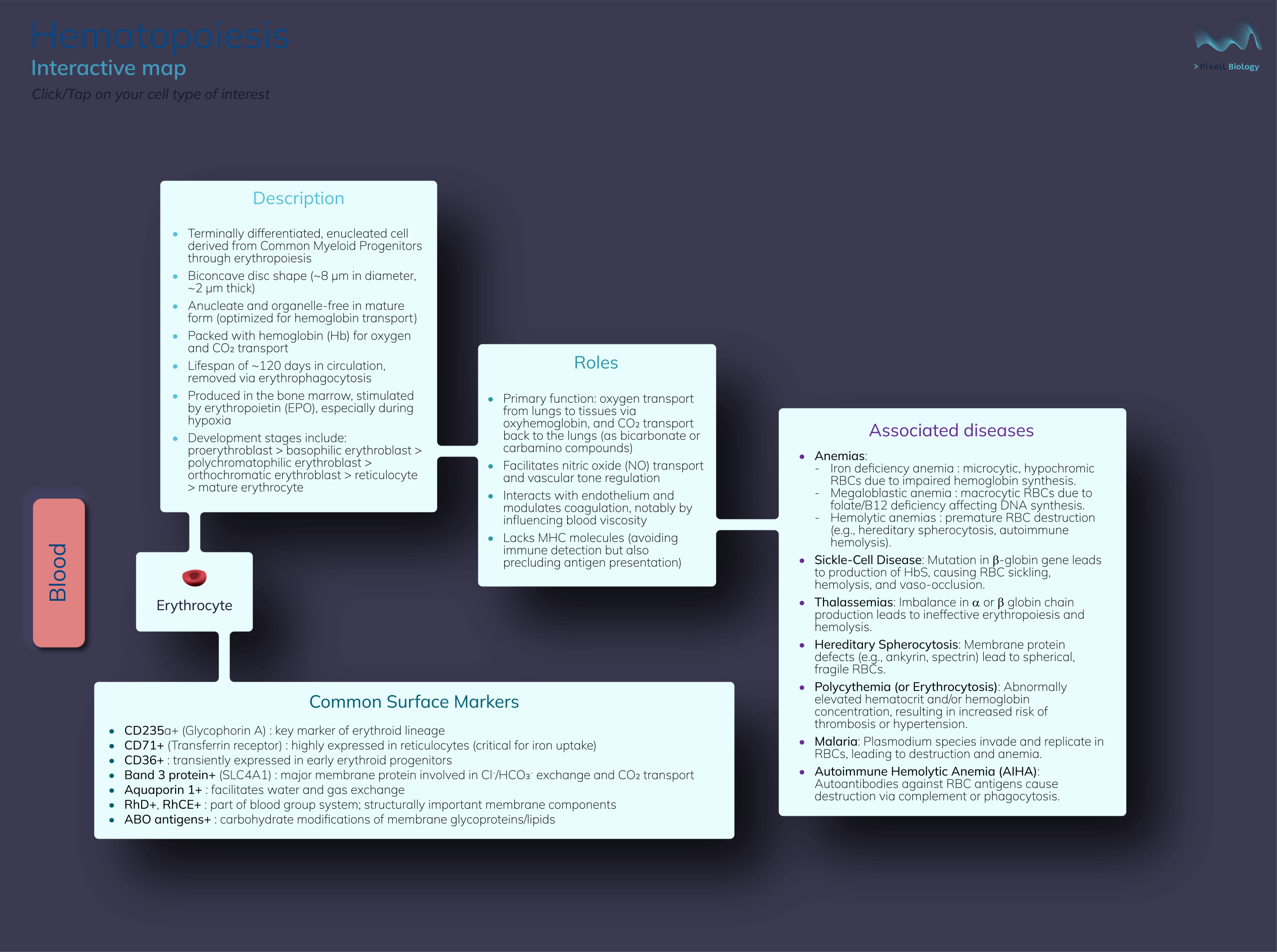
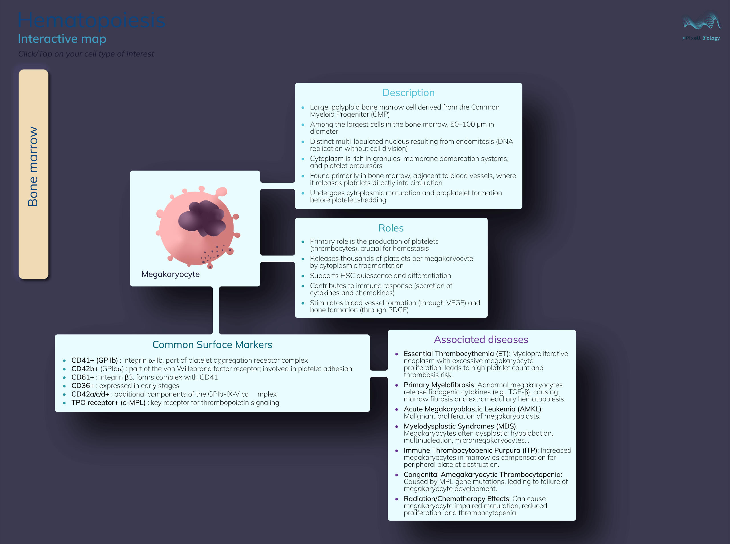
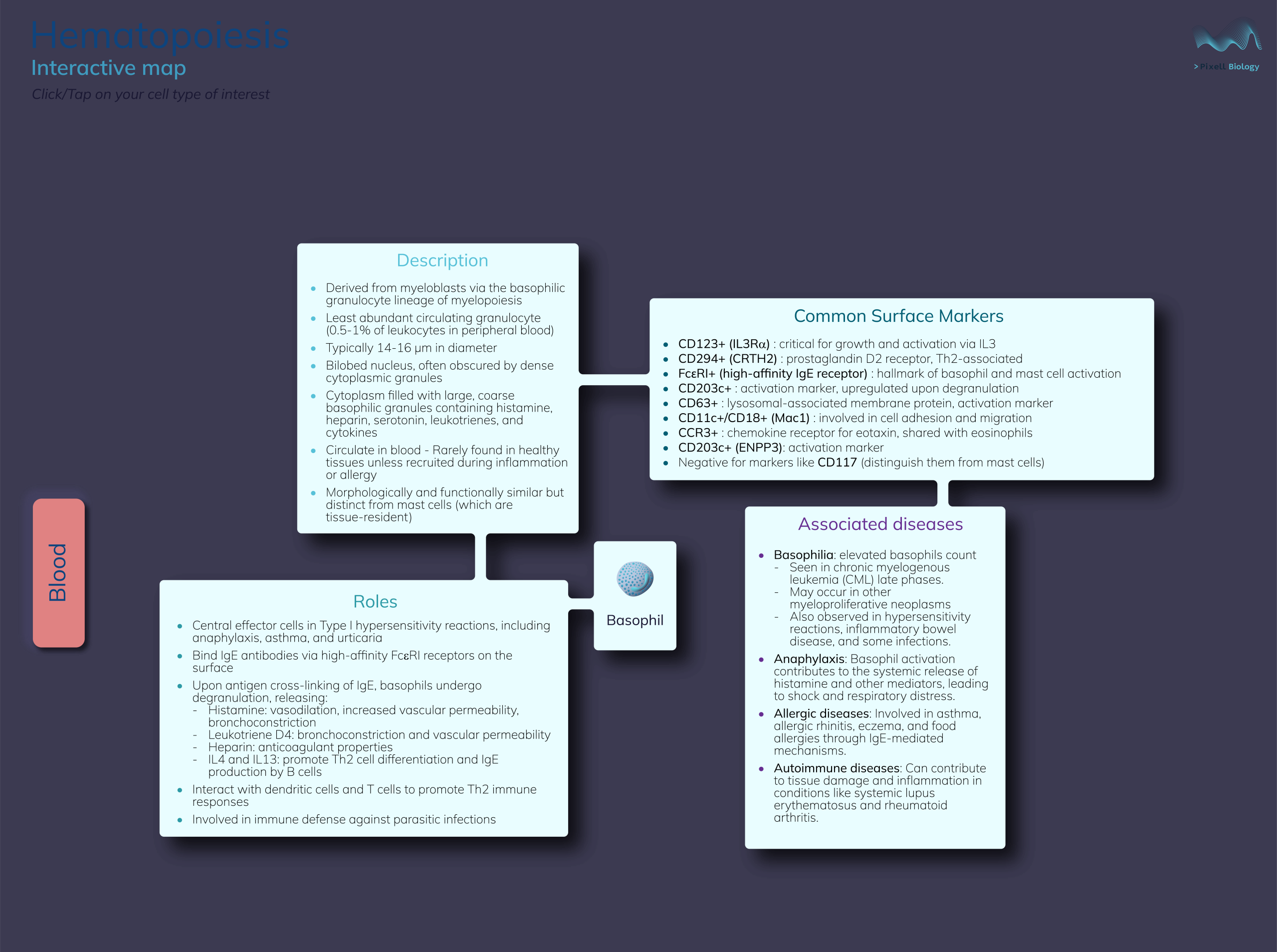
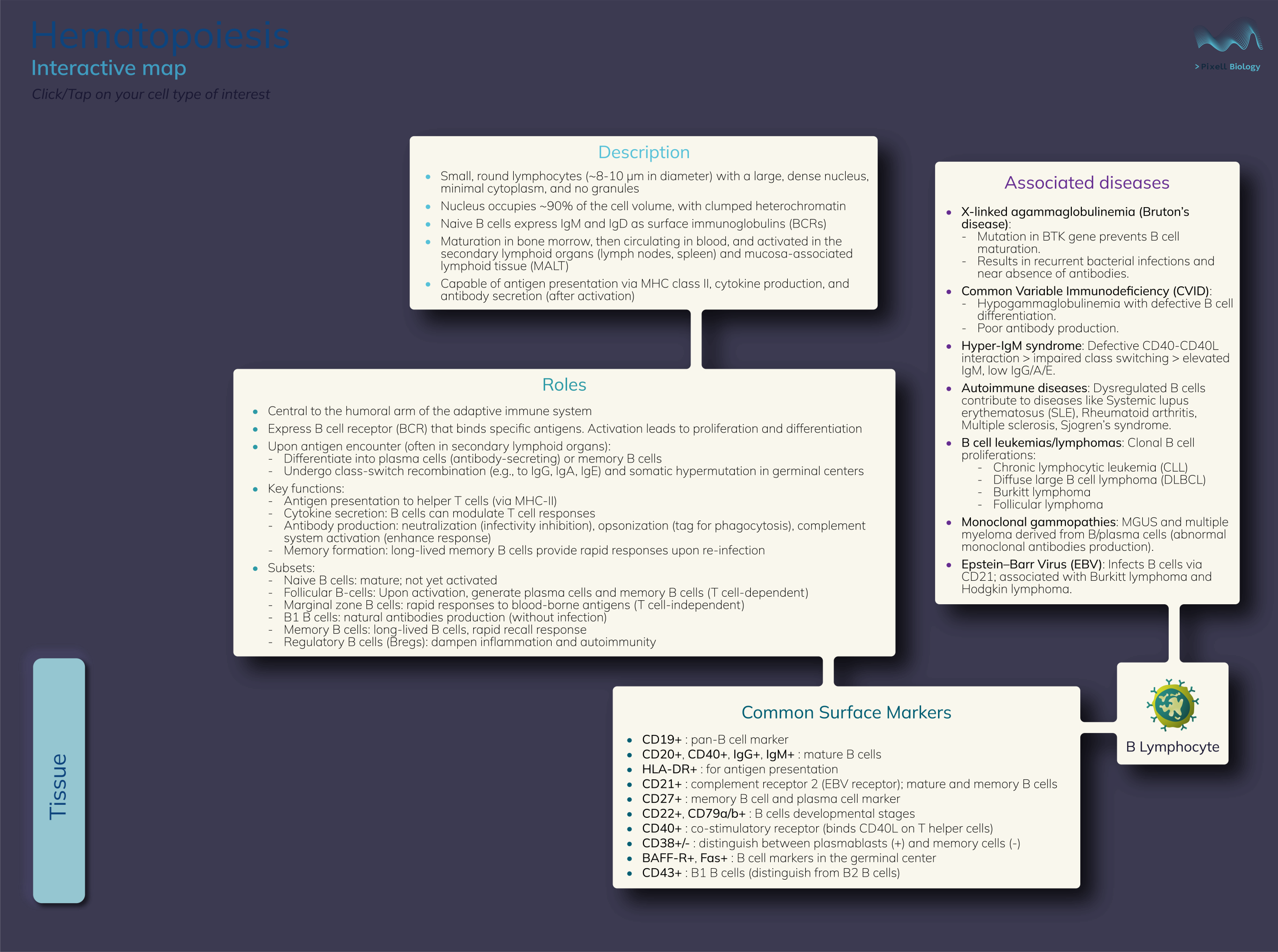
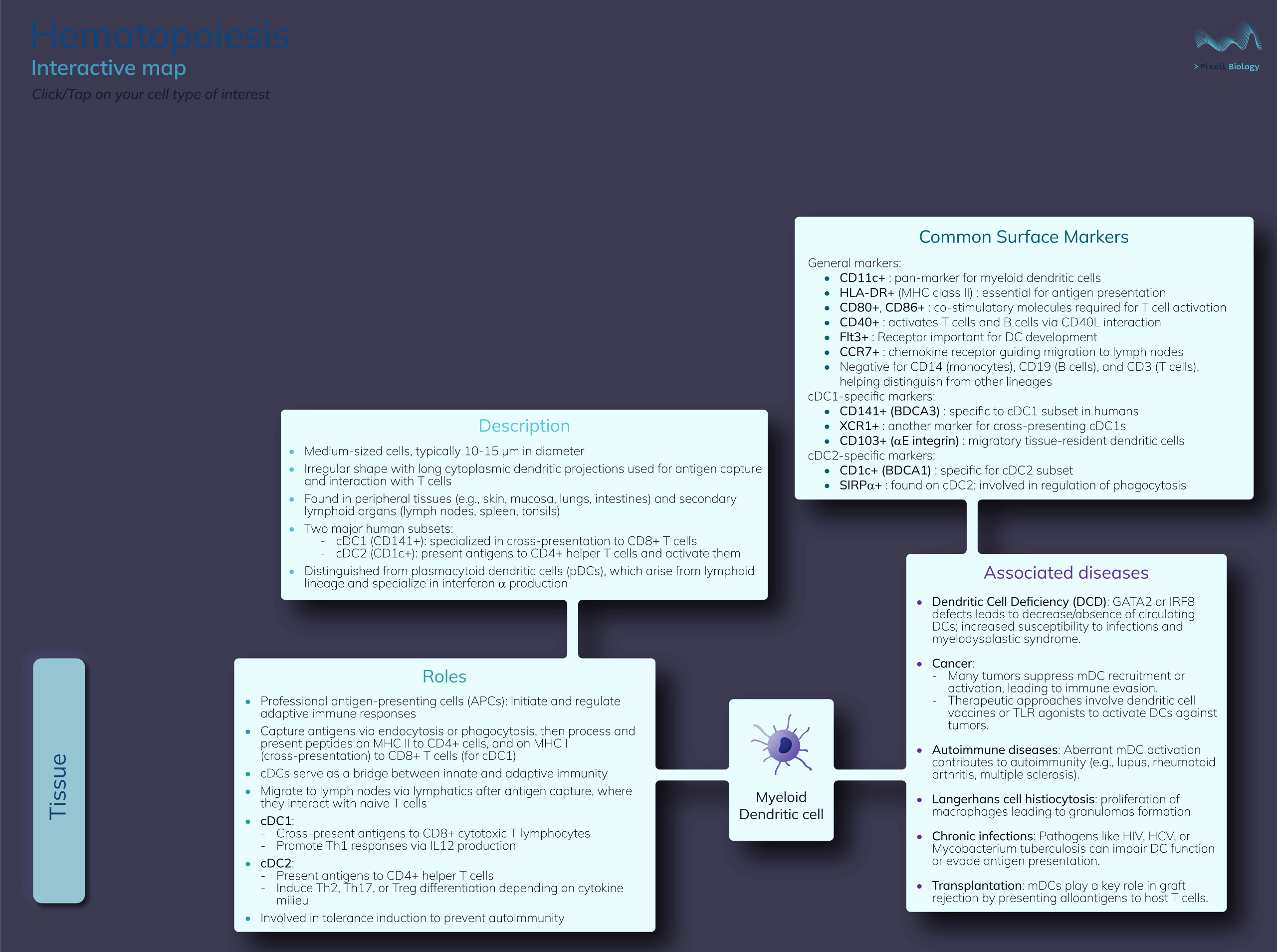
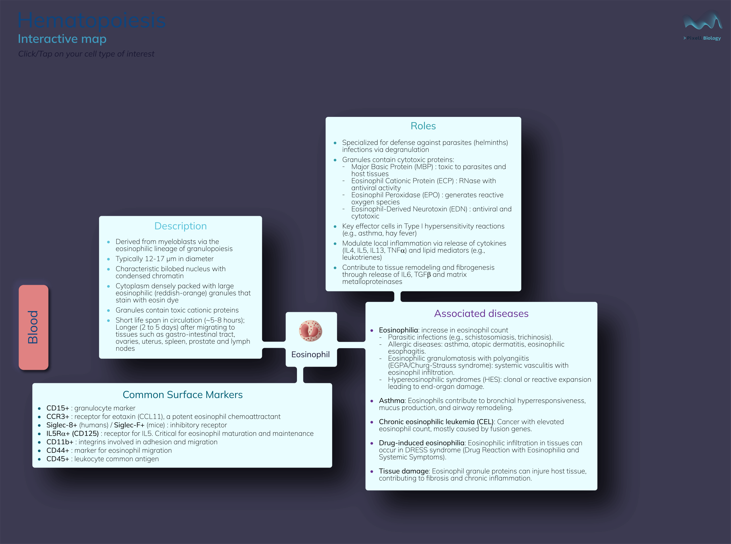
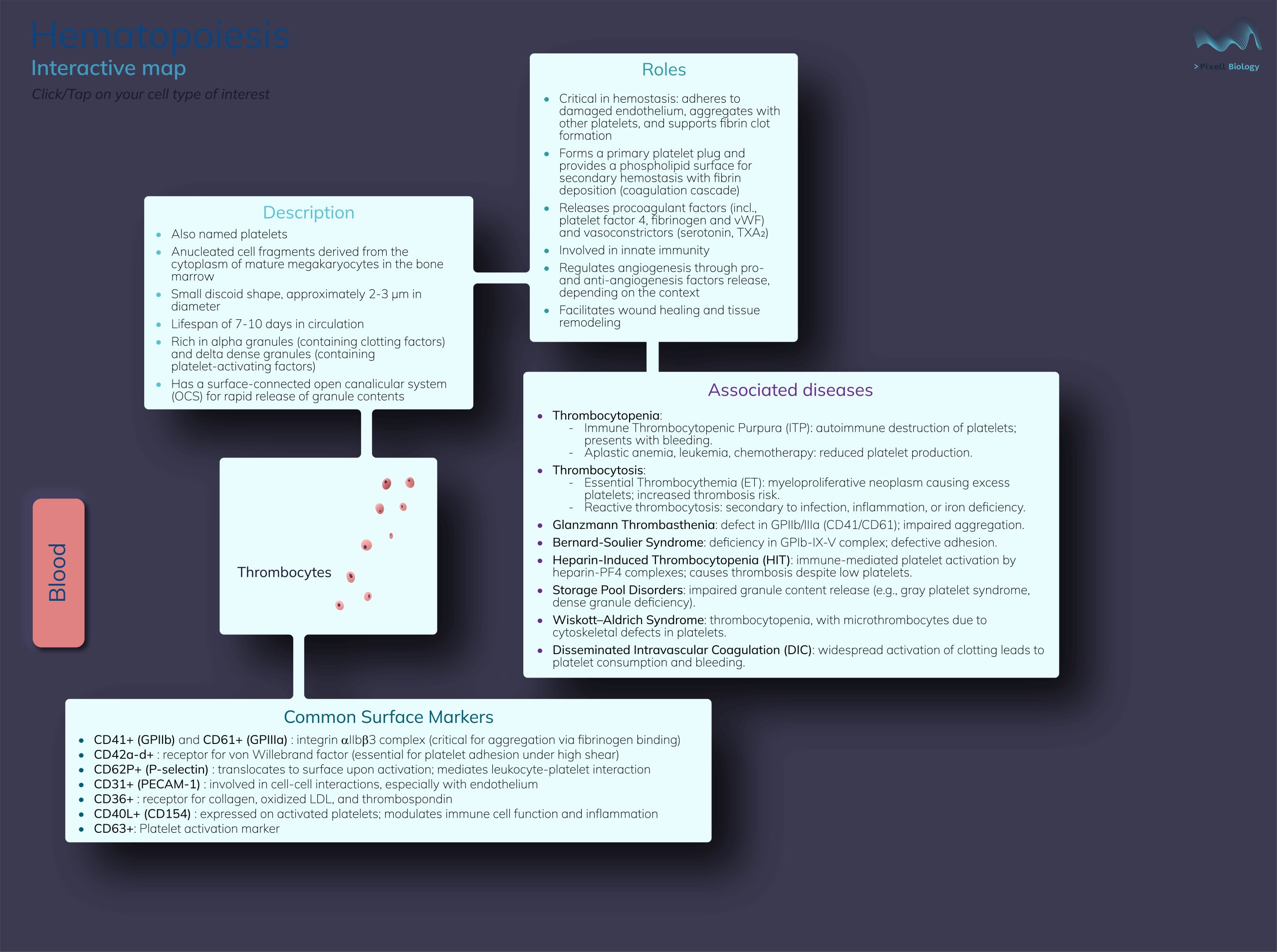
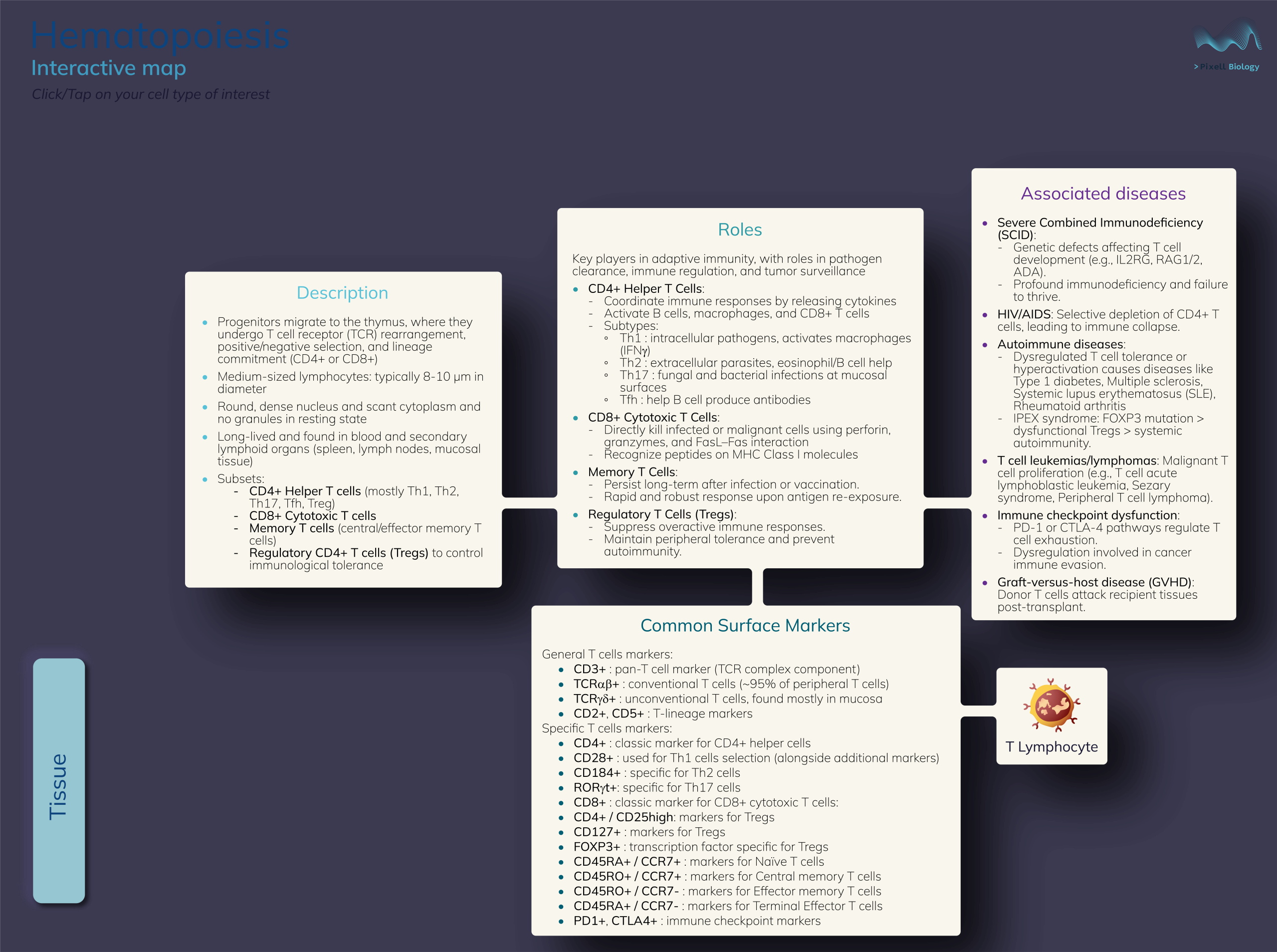
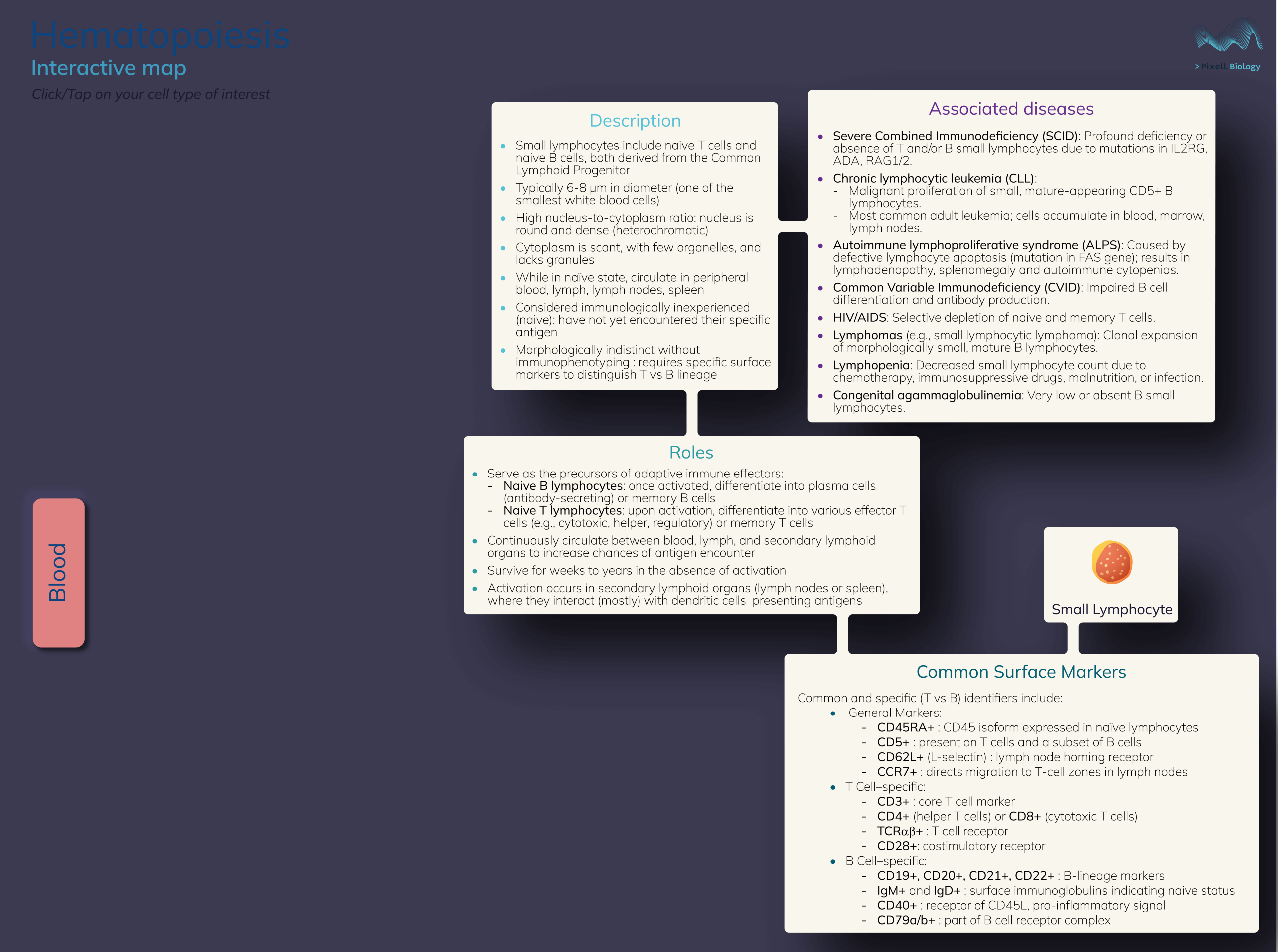
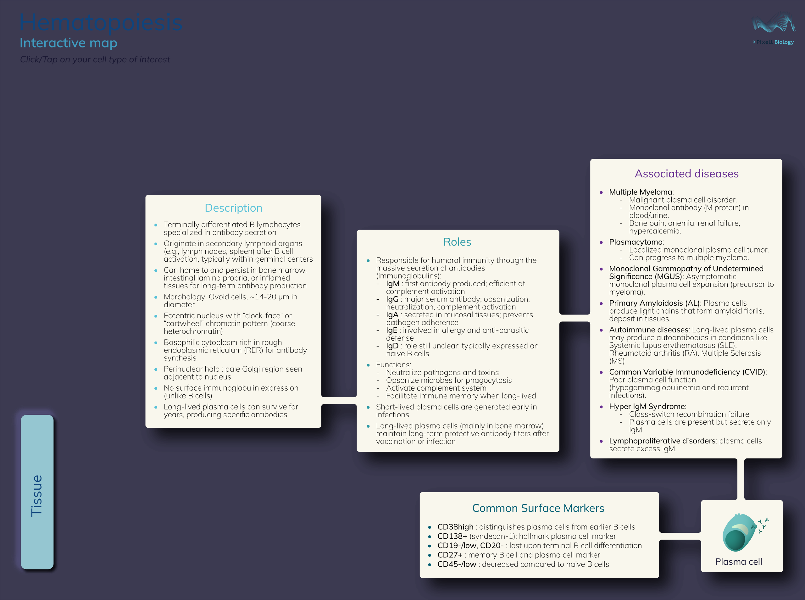
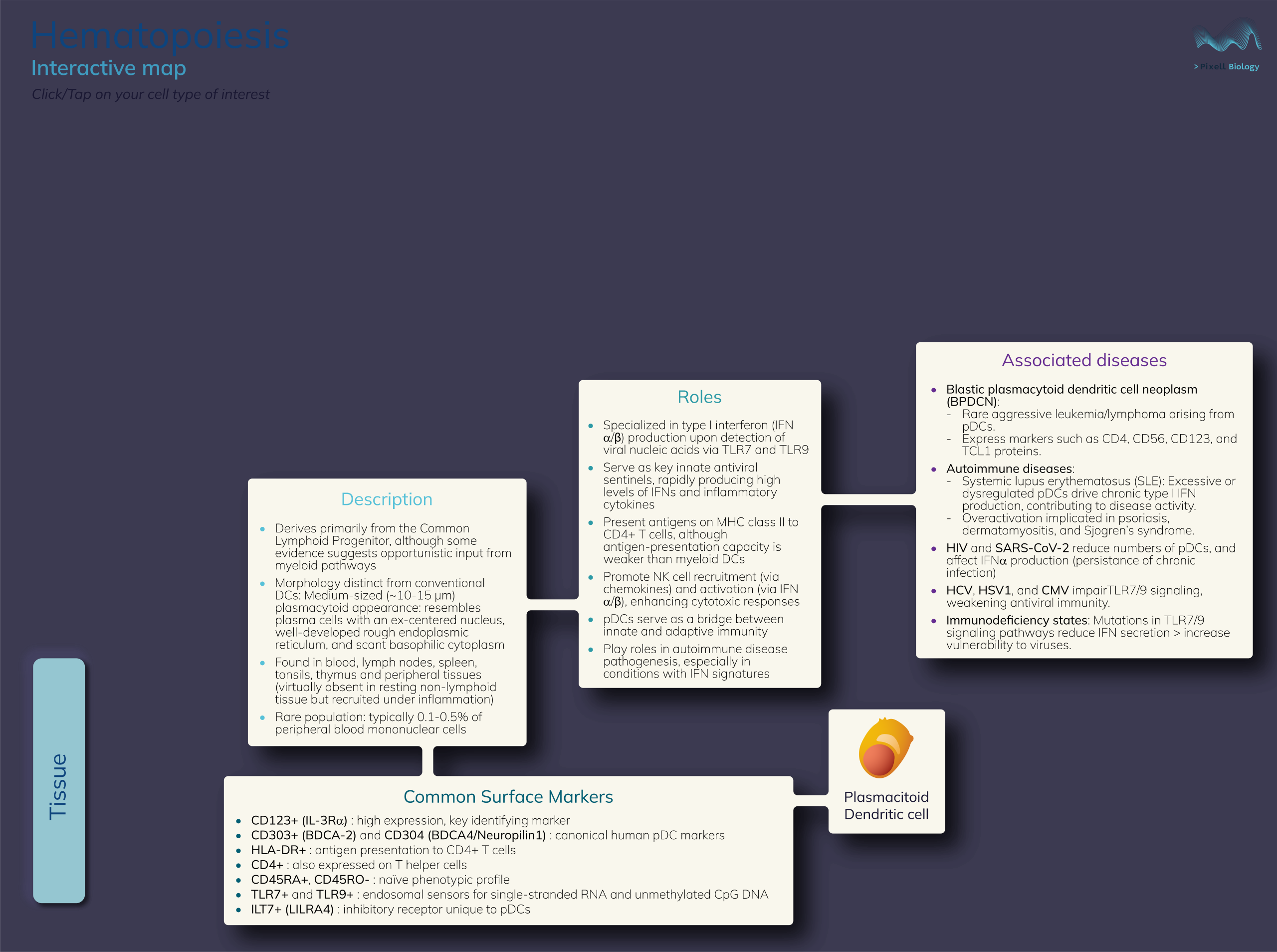
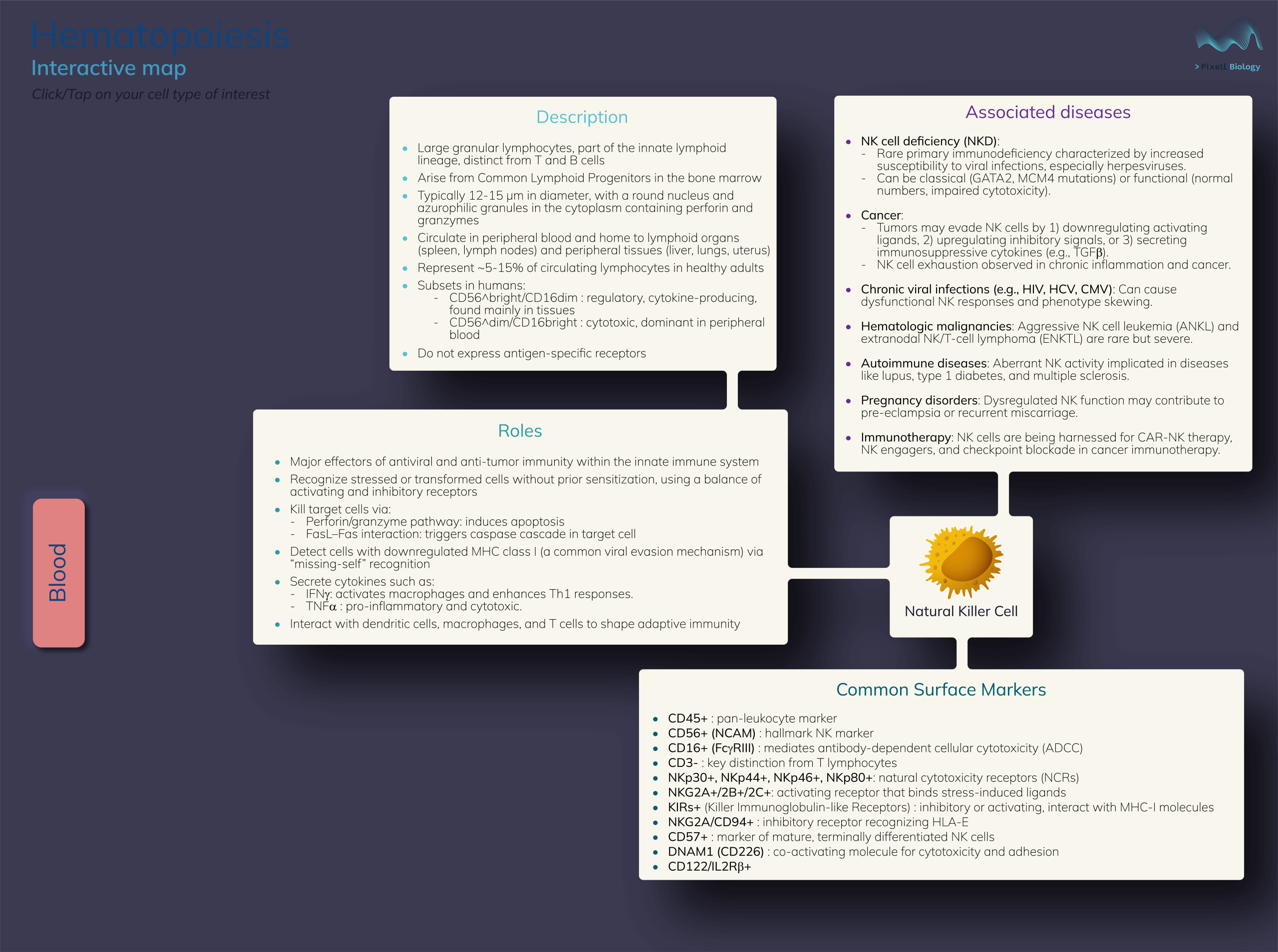
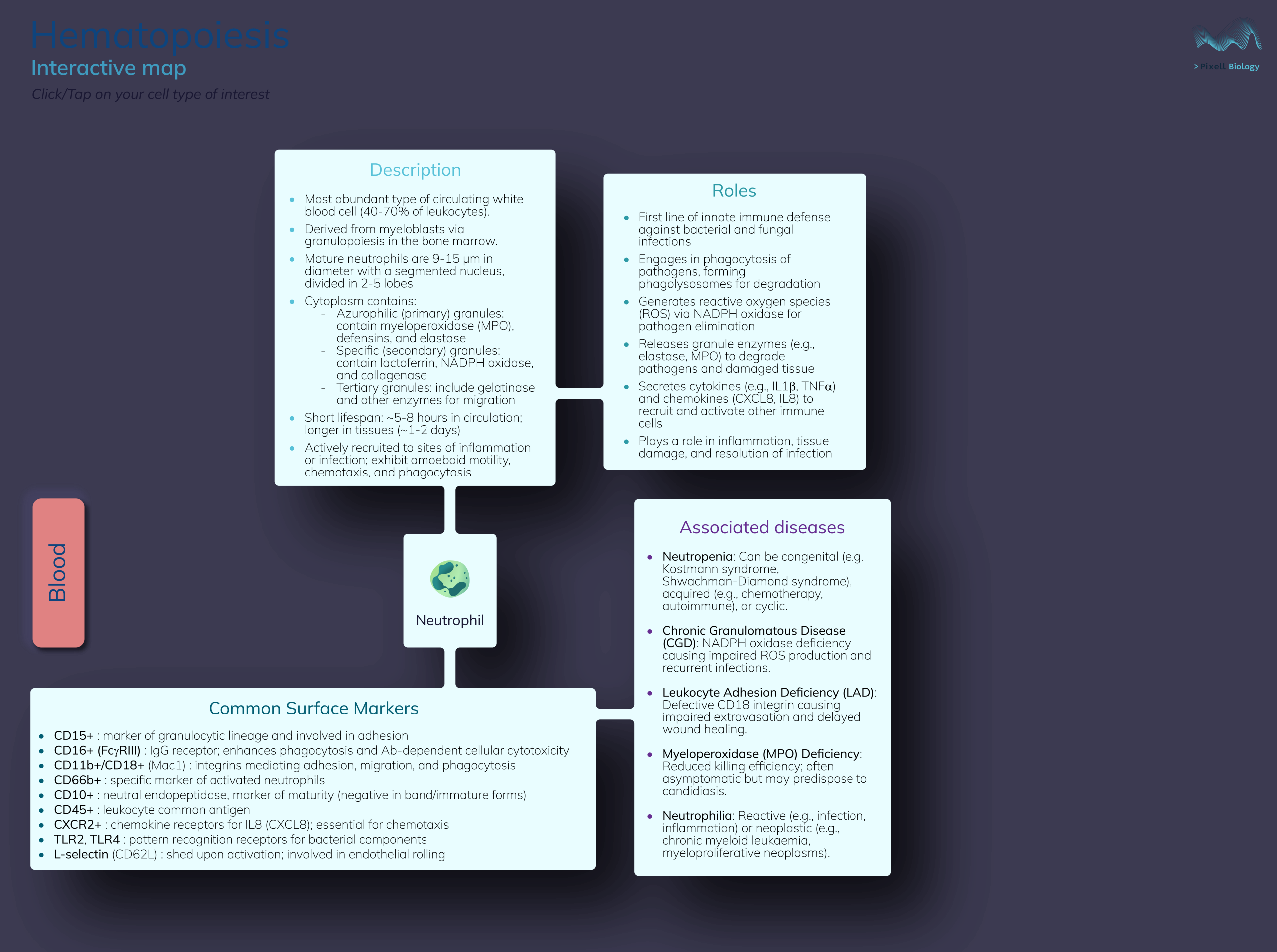
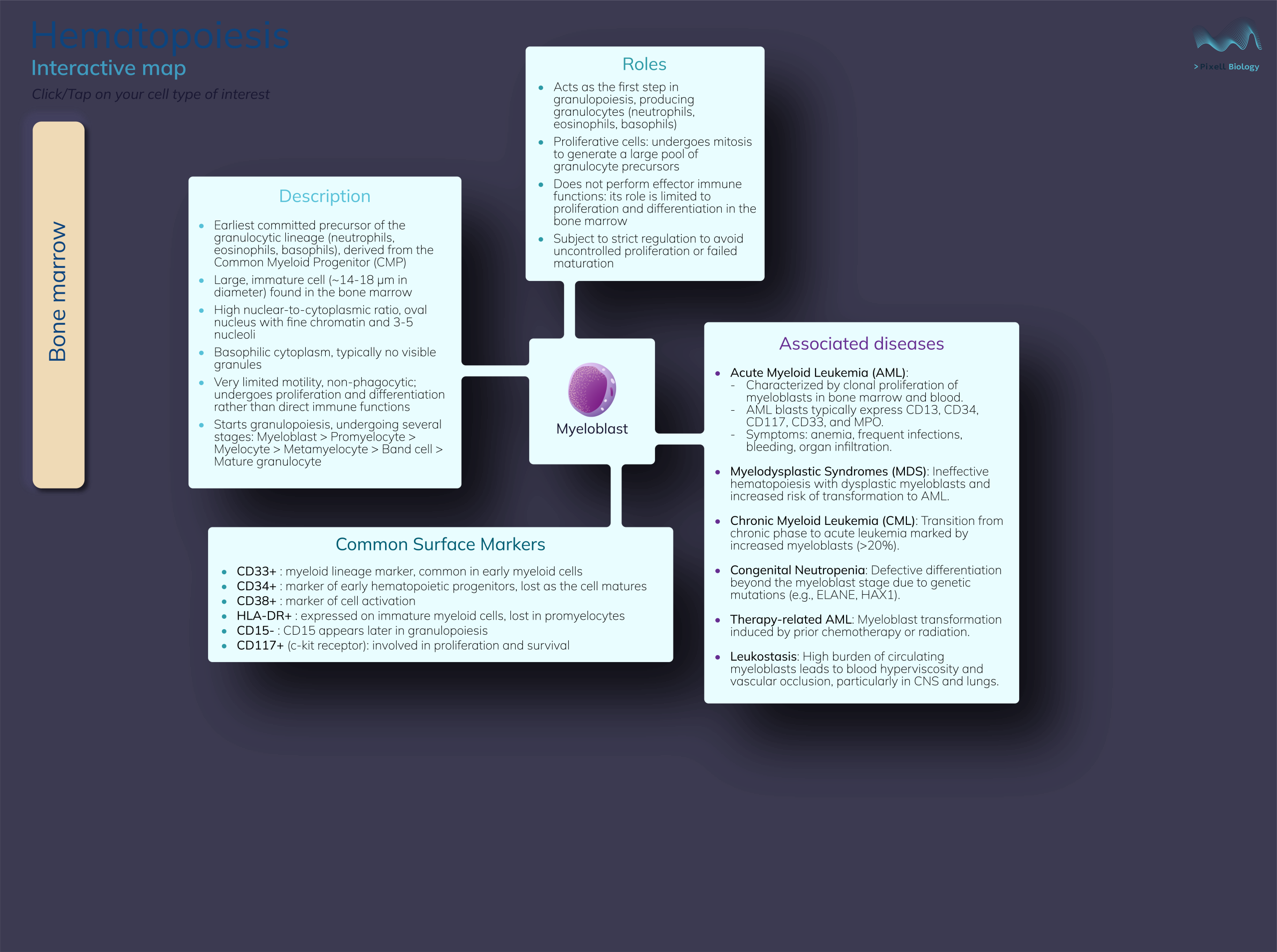
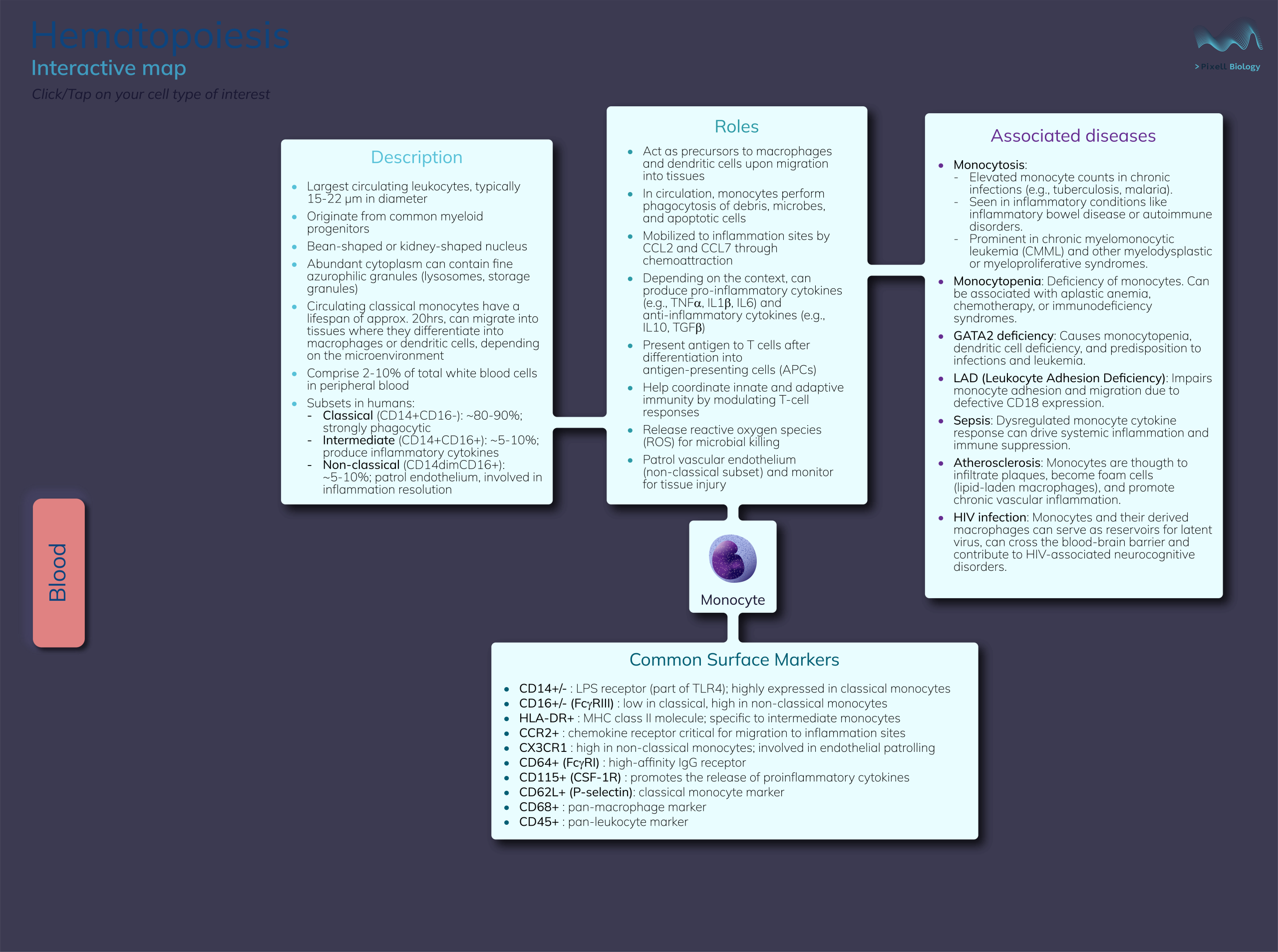
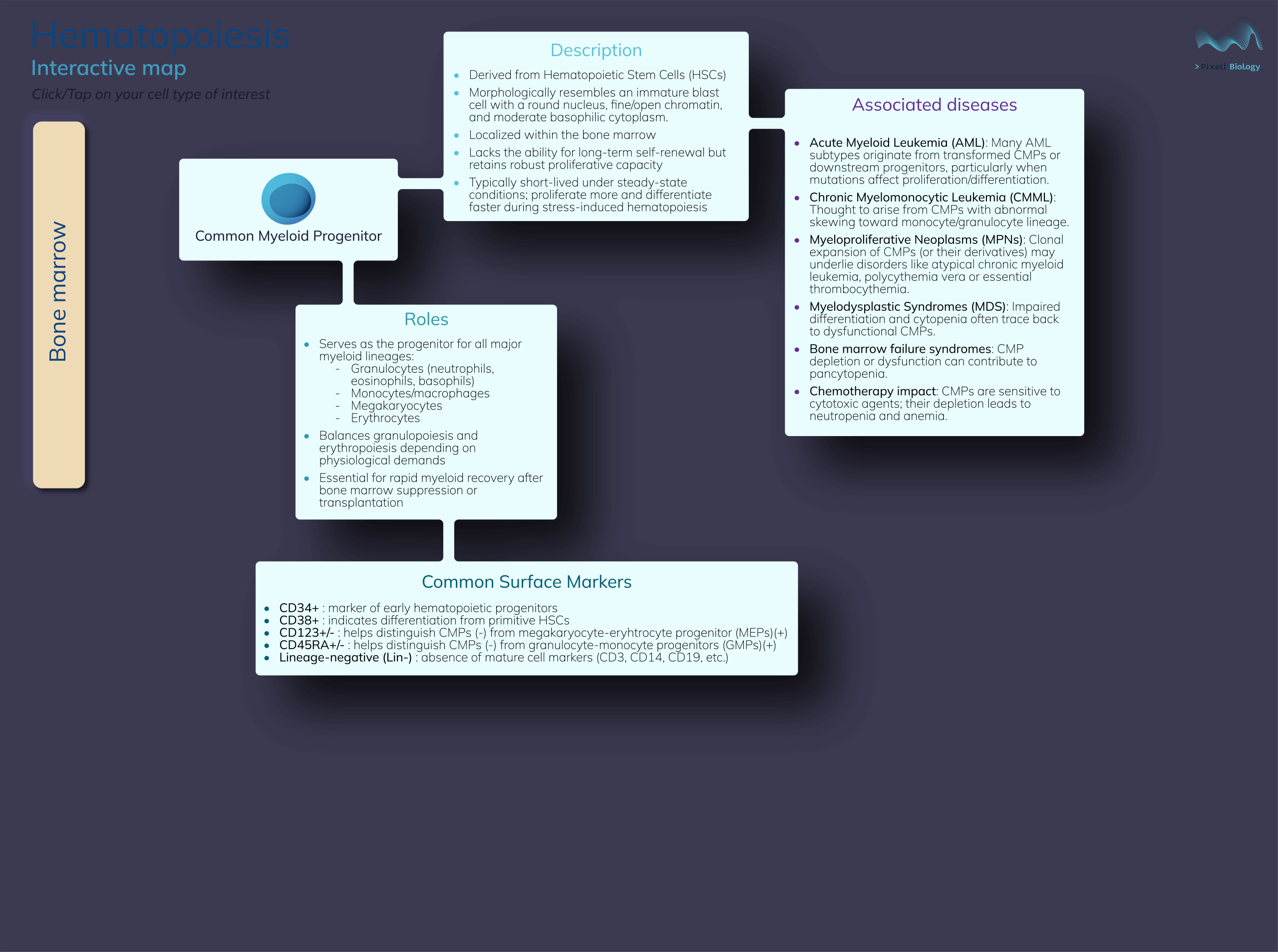
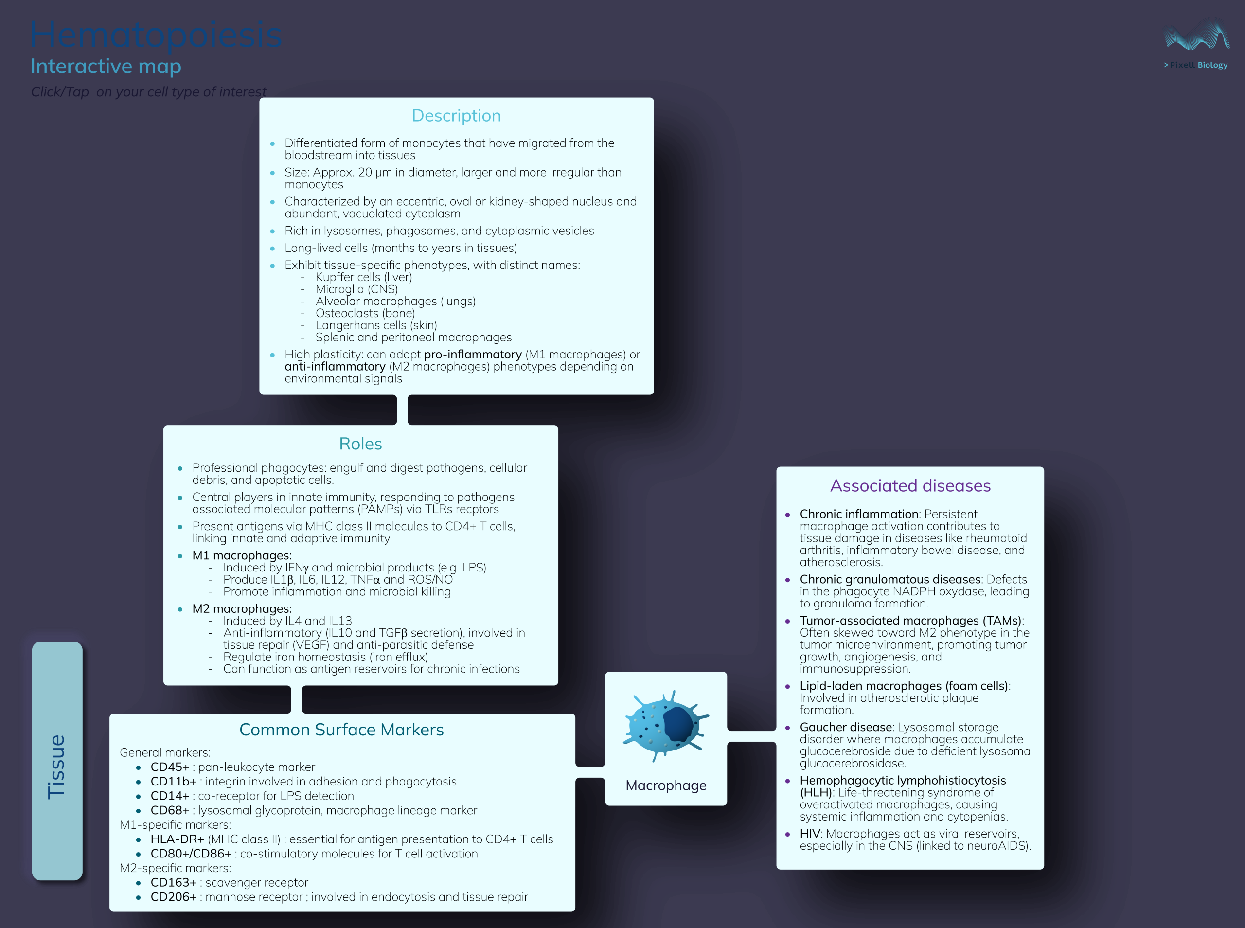
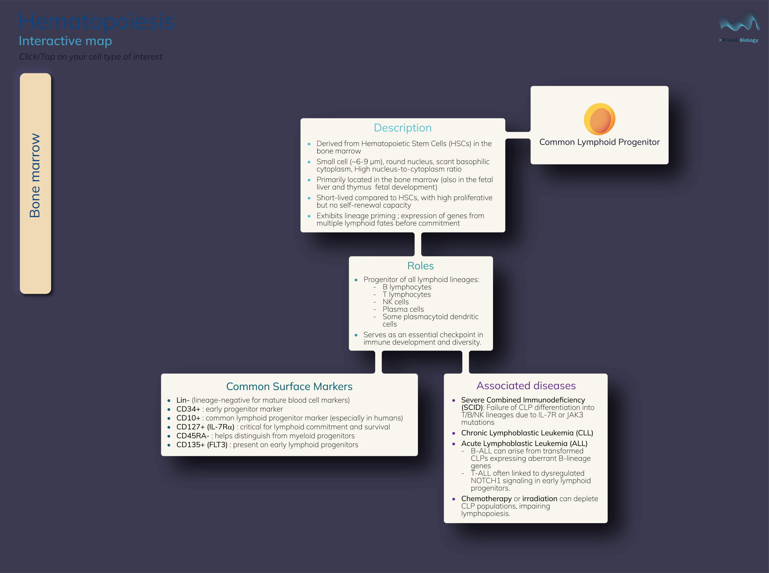
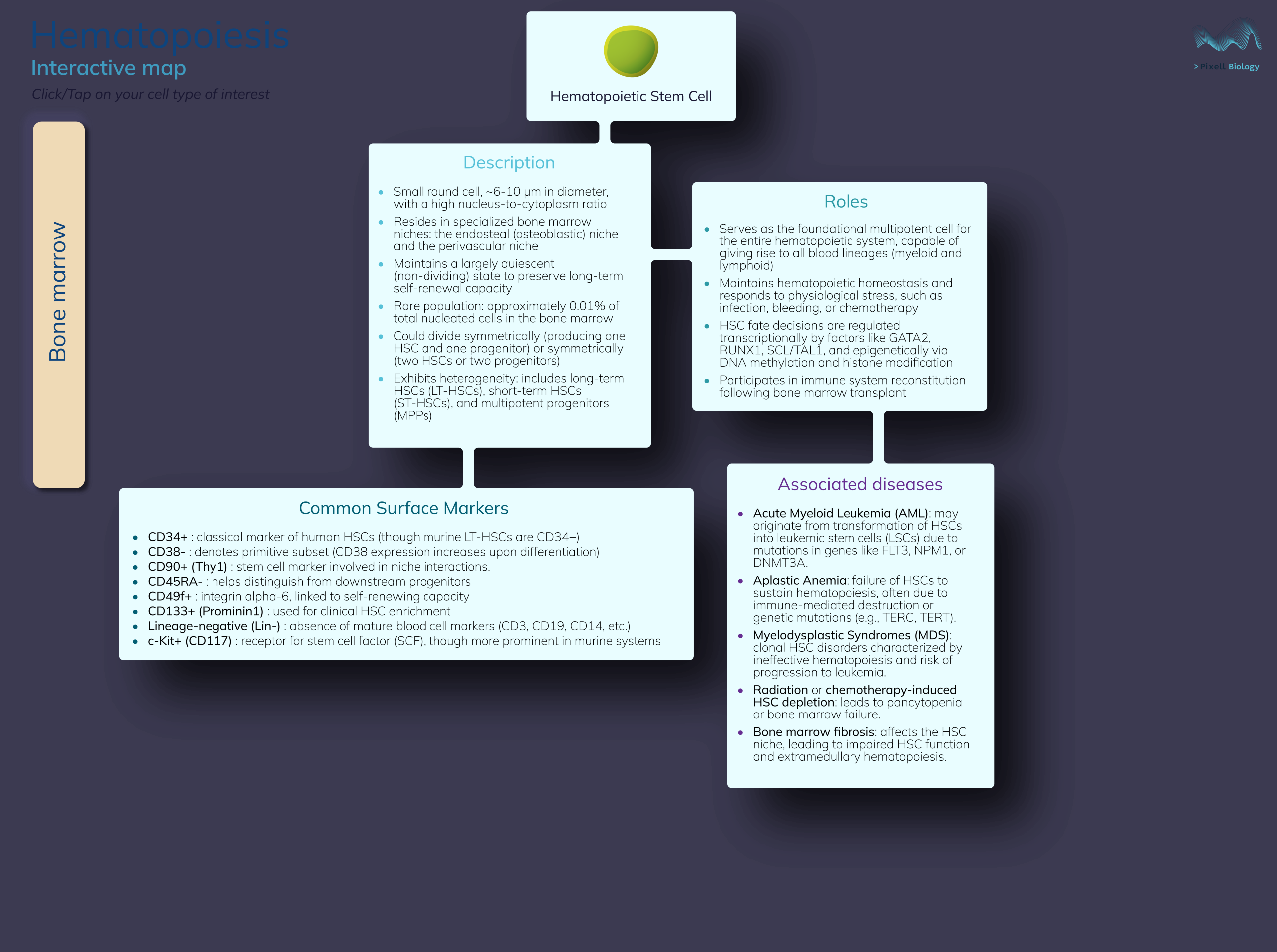
Hematopoiesis is a complex journey from hematopoietic stem cells to all blood cell types, each playing a unique and complementary role in immunity. This figure brings clarity by not only showing the differentiation pathways but also highlighting each cell type’s description, functions, surface markers, and related pathologies. By displaying everything on a single, well-organized map, it reveals how the delicate balance and interplay between cell types is both crucial and fragile, making this intricate system easier to understand at a glance.
Click on any of the depicted cell types to get informations about their description, functions, surface markers and associated pathologies.
Program used:
Adobe Illustrator
(HTML and JavaScript for interactivity)
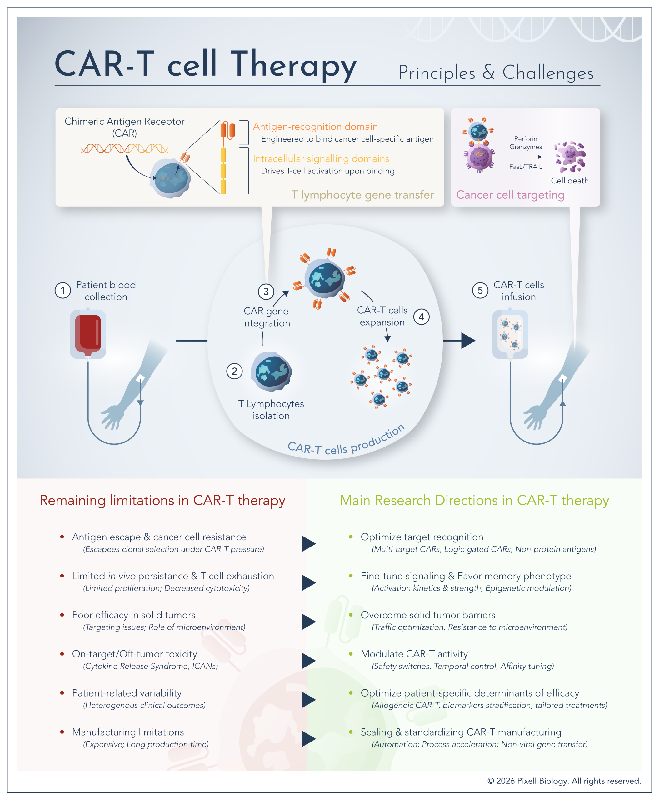
This infographic provides a structured overview of CAR-T cell therapy, from T cell collection and genetic engineering to reinfusion and tumor cell targeting. It outlines the core mechanism of action while highlighting the remaining limitations that currently restrict efficacy and scalability. In parallel, it maps the main research directions aimed at overcoming these challenges, offering a system-level perspective on how CAR-T therapies are being optimized.
Program used:
Adobe Illustrator