Seeing is Understanding: What David McCandless Teaches Us About the Power of Visuals
In the age of information overload, how do we make sense of the chaos? Enter David McCandless—data journalist, designer, and the mind behind Information is Beautiful. Mastering data visualisation, he conveys complex ideas, massive datasets, or global trends using a single chart or visual mapin, in ways that feel almost… effortless.
But this isn’t just about pretty graphics. McCandless’ work shows us that visual storytelling is one of the most powerful tools we have to clarify, reveal, and persuade.
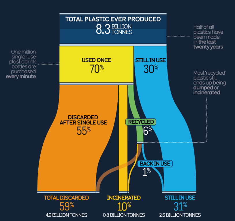
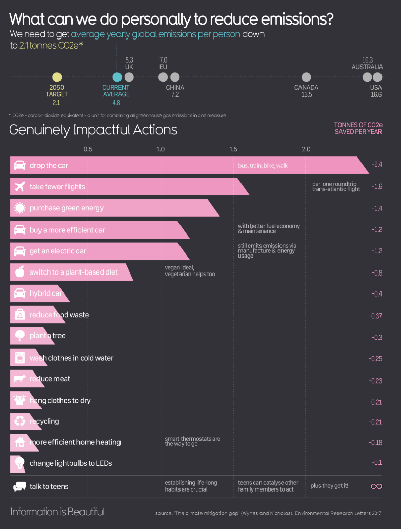
One of McCandless’ most iconic skills is transforming numbers into narratives. Whether he’s visualizing the relative costs of war, the impact of COVID, or the issues with plastics recycling (see below), his work makes the invisible visible. With his data visualisations, patterns emerge and questions arise.
By mapping data into color, space, shape, and hierarchy, McCandless shows how visual language taps into the way our brains are wired to perceive relationships—and understand them.
In McCandless’ philosophy, beauty is not decoration—it’s function. Well-designed visuals reduce cognitive load, highlight key takeaways, and create emotional impact.
“Design isn’t just decoration. It’s a form of explanation.”
This is especially crucial in science communication, where audiences may feel overwhelmed by complexity. With clean visuals and intuitive layouts, we can turn confusion into clarity—and apathy into curiosity.
For scientists, researchers, and educators, McCandless’ work is a reminder that how we present information is just as important as what the information is. A cluttered chart can obscure the truth. A thoughtful visualization can reveal it.
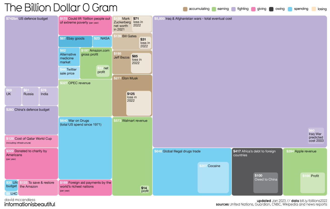
As you scroll through his works—whether it’s the Billion-Dollar-o-Gram, the Snake Oil Supplements chart, or The Colours in Culture—you’re not just learning facts. You’re learning how to see differently.
David McCandless doesn’t just visualize data—he translates it. His work is proof that information design is not a luxury, but a necessity in the modern world. If we want to share knowledge, inspire action, or explain science in a way that sticks, we need to think visually—just like he does.
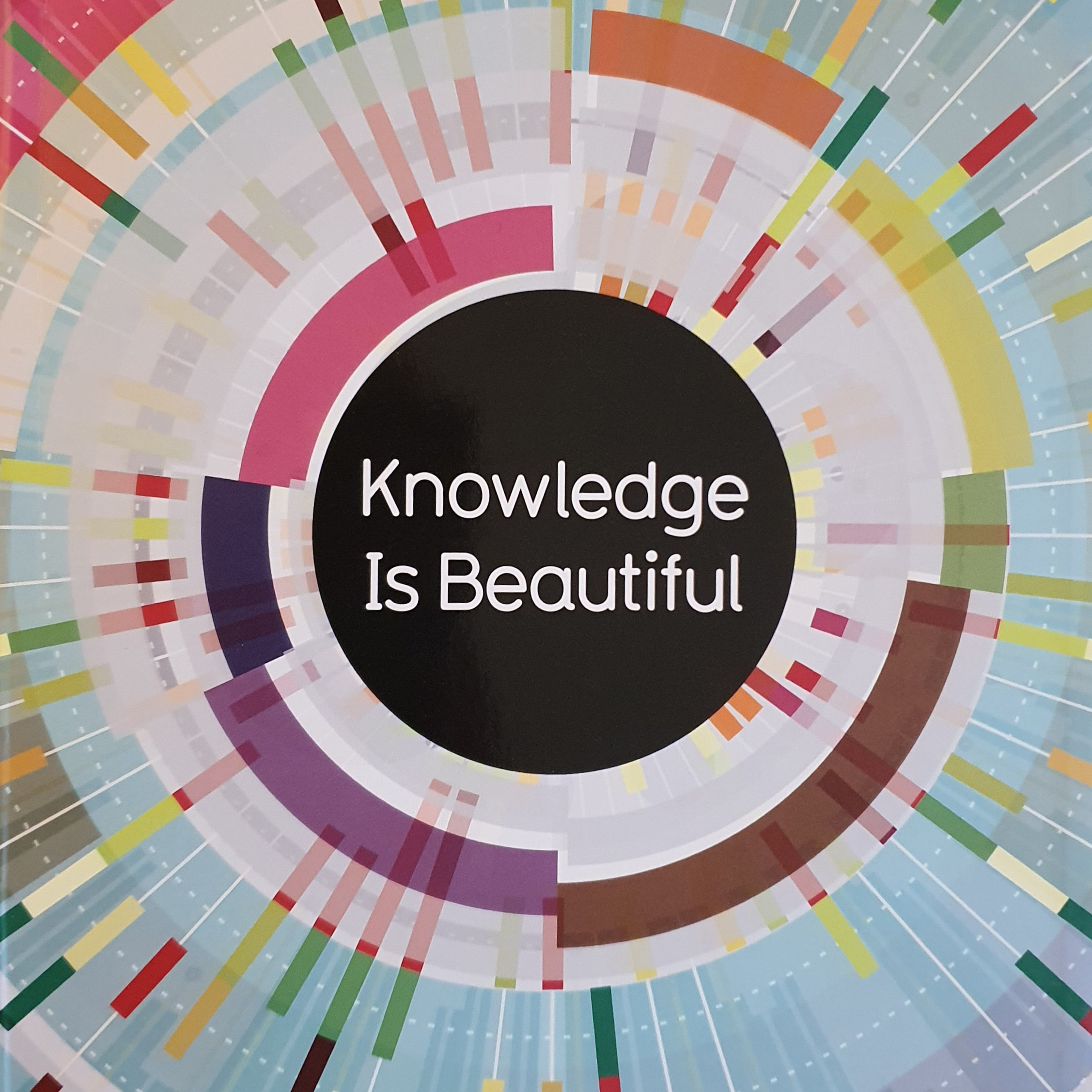
“Knowledge is beautiful” (Harper Collins publishers) is a perfect gift for curious minds, and I also encourage you to visit McCandless website (“Information is beautiful“) if you want to know more about his data visuals.
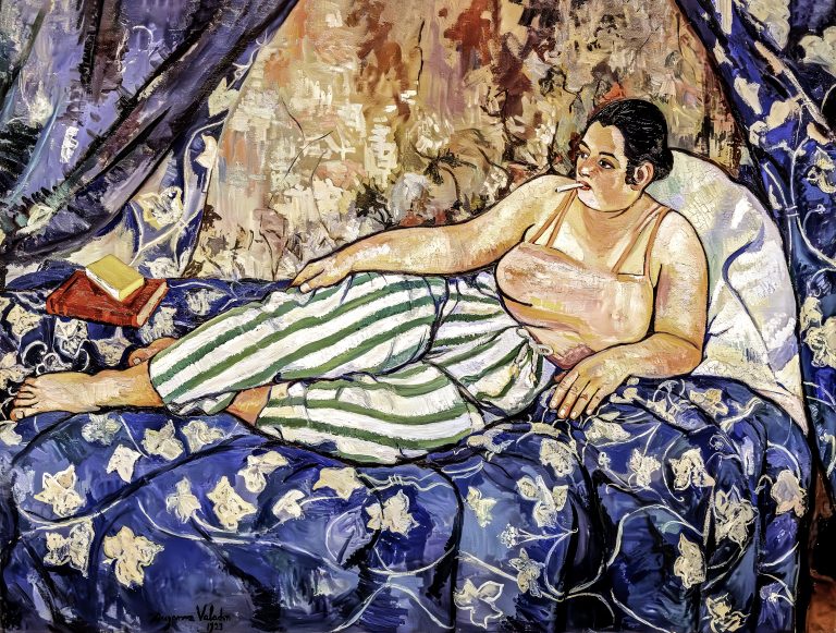
In a world where women were on the canvas but rarely in front, Suzanne Valadon (born in 1865) picked up the brush and changed the frame. Once a model for famous artists like Renoir and Toulouse-Lautrec, she became a self-taught painter whose bold, grounded, and unapologetically human images challenged conventions of femininity, beauty, and artistic…